Designing the Visual Interface Coursework
Bloom Healthcare
An application designed to lessen the gender gap in UK healthcare utilising education and the sharing of vital health information.
This coursework required the development of a Figma prototype and full design style sheet.
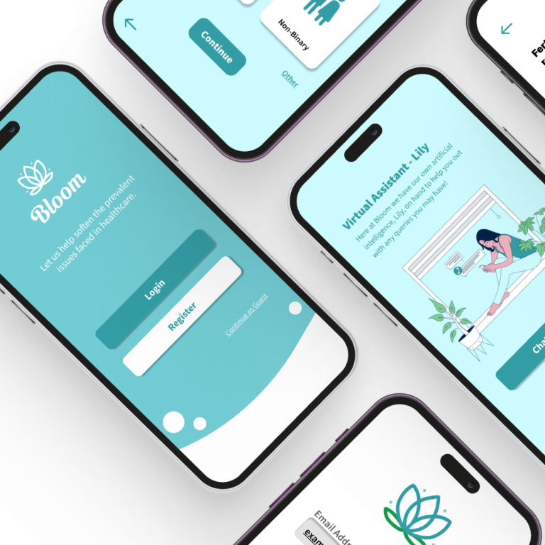
Final Prototype
The Design Process
Project Mind Map
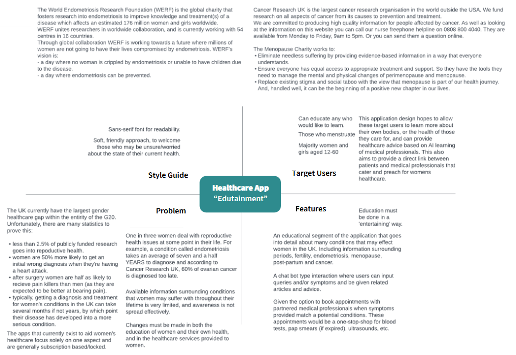
Before design work started, a mind map was created to rapidly ideate and collate information that could later be used to inform design decisions. The mind map was split into four main segments based on the design brief, the definition of the problem, the features that the application could utilise to solve this problem, the target users, and a simple style guide.
Project Synopsis
Throughout research conducted in the last few years, it has been revealed that the UK currently have the largest gender gaps in healthcare within the entirety of G20, 12th globally. This however, does not come as a surprise for some of us women who rely on this underfunded healthcare.
Statistics that prove this underlying issue:
- Less than 2.5% of publicly funded research goes into reproductive health.
- Women are 50% more likely to gain an initial misdiagnosis when they’re experiencing cardiac arrest.
- It can take an average of 7 and a half years to gain a diagnosis for endometriosis - a debilitating condition that causes immense pain for those who suffer.
- According to Cancer Research UK, 60% of ovarian cancer is diagnosed too late!
- 26% of young women experience a common mental disorder, compared to that of 9.1% of young men.
- Women are significantly more likely than men to be undertreated for pain by doctors.
The Royal College of Obstetricians and Gynecologists (RCOG) ‘Better for Women’² report focuses on improving the health and well-being of girls and women but also highlights the problems women face when it comes to their healthcare. Many themes were derived from this research, the main points being: that women cannot always find accurate (health) information, the NHS continues to be an intervention service (rather than a prevention service), and many women’s healthcare services are disjointed and inaccessible.
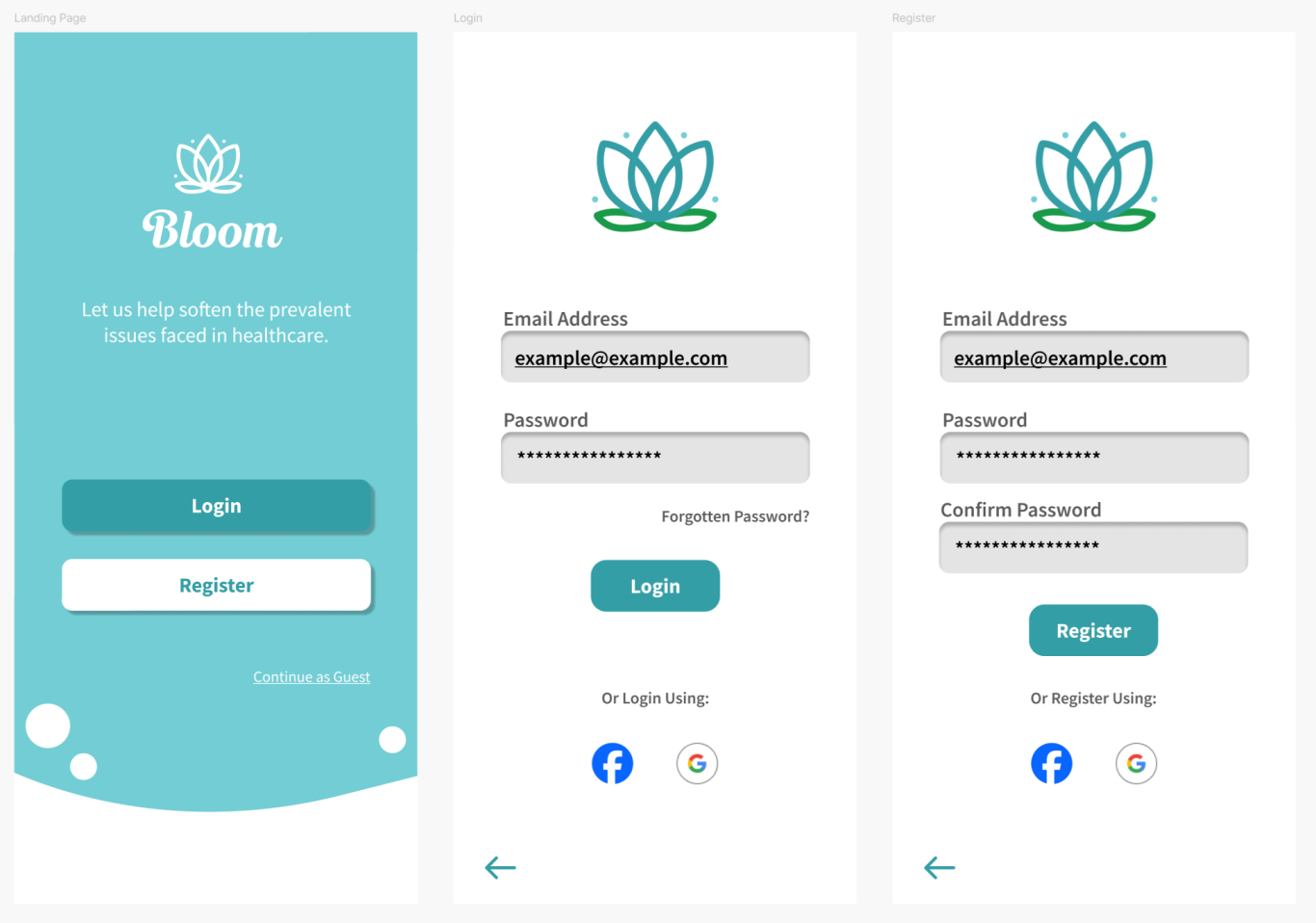
Bloom hopes to improve access to information and services within women’s healthcare, and allow for women to have an overall better experience. Supplying a place for women to:
- Learn about their bodies and conditions that may arise throughout their lifetime.
- Compare their experiences and symptoms to those of possible conditions.
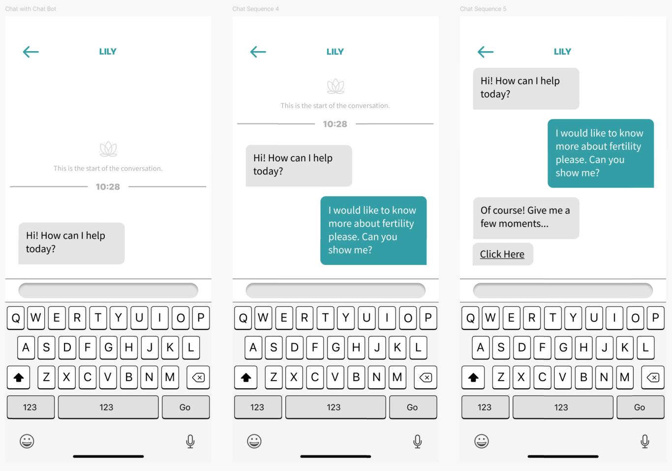
- Query an advanced chatbot AI.
- Book appointments with registered medical professionals in their area for a ‘one-stop’ service of consultation and necessary tests if applicable.
Target Users
It is believed that users aged between 15-55 are more likely to use this kind of application, however, it will be important to note that those aged 9+ may find some segments of this educational experience beneficial.
The nature of this application is most applicable to those who are women, however, there are a minority of non-female users who would benefit from an application such as this: transgender males and non-binary individuals.
This is aimed at users within the UK health system as it links directly with available doctors through the NHS, a UK-based healthcare provider. Although the educational information supplied on the application would be applicable world wide.
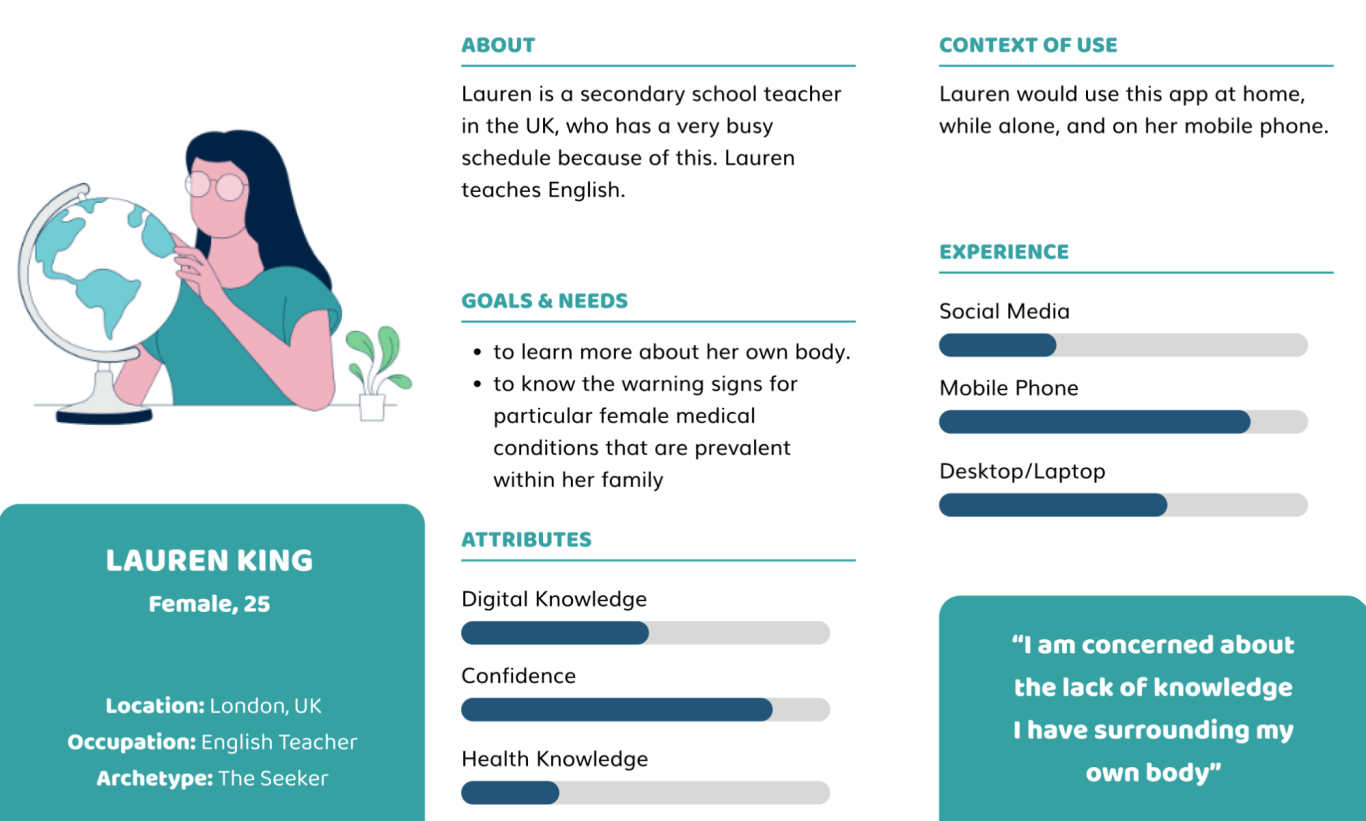
Below, a user persona was created to highlight the target user and to create empathy for this primary user group whilst designing.
Colour Palette
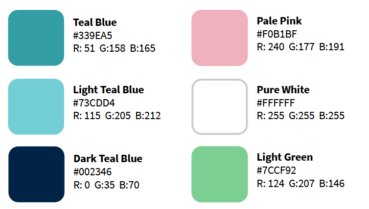
The colour palette selected for Bloom was considered heavily and changed throughout the course of the project. In the beginning, it consisted mainly of pink hues, representing the femininity that Bloom represented, however after some user feedback, many people suggested it felt too girly, and took away from the main healthcare themes that the application should follow. From there, teals and navy colours were selected, colours used throughout many healthcare settings and suggest trust and cleanliness, with colour theory.
Typography
Two main fonts were selected for use within the application, Beanco Demo and Source Sans 3 variants.

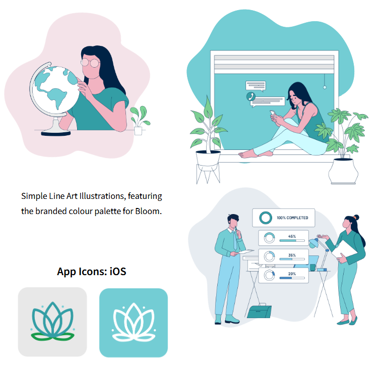
Illustrations & Branding
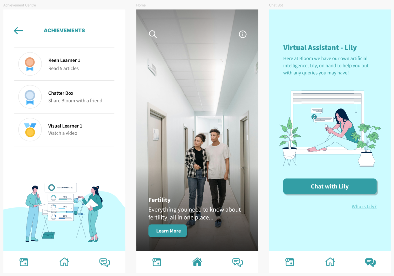
These drawings are used to illustrate aspects of the application, for example, the illustration with the girl on her phone texting is used within the chatbot introduction pages, and the goals illustration is featured on the achievements page.
The lighter feel of the images fits well with the context of use of the application. Paired with the softer colour palette, the illustrations and branding enables the user to feel more relaxed and at ease.
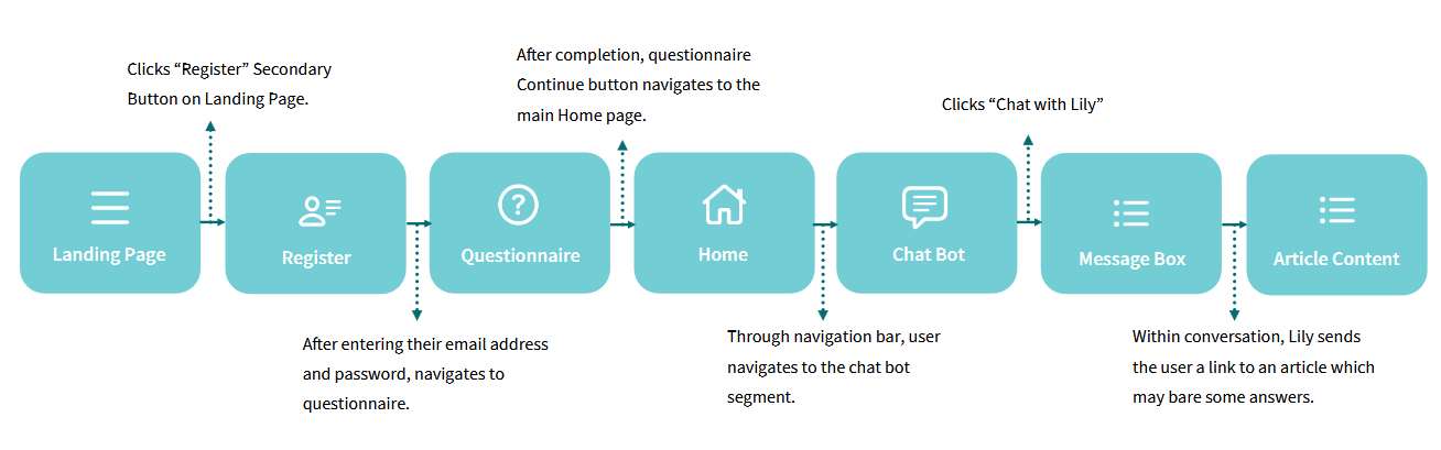
User Journey / Vertical Slice
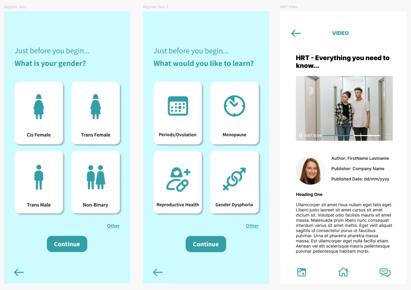
A user journey is depicted below of the journey a user may take as they traverse through the final prototype, it is expected that users will all begin on the landing page, login/register, complete the start-up questionnaire, and then naturally explore the applications articles and chatbot features.
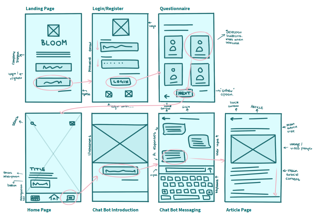
Wireframing
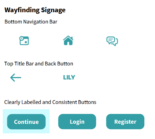
Navigational Patterns
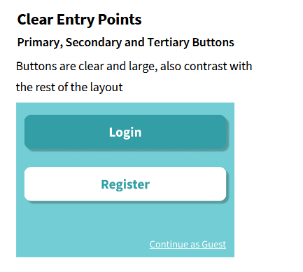
Information hierarchy is important in a complex application like this, with many individual article pages, and many different paths a user may take through the layouts. Navigational patterns, as shown here, are featured throughout the application to allow the user to flow through the application as they desire.
© Copyright. All rights reserved.
We need your consent to load the translations
We use a third-party service to translate the website content that may collect data about your activity. Please review the details in the privacy policy and accept the service to view the translations.