
Advanced Web Technologies Re-design
Food Solutions
A dynamic website originally developed using Python Flask, HTML and CSS, that has recently been overhauled with a new visual interface design using Figma.
Final Prototype


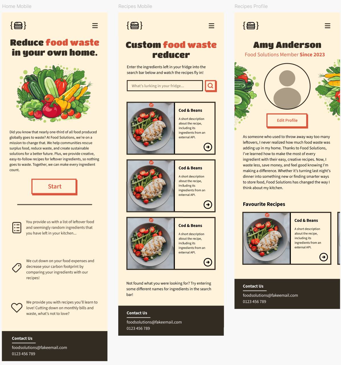
Mobile Prototype
The Design Process
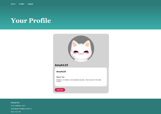
BEFORE
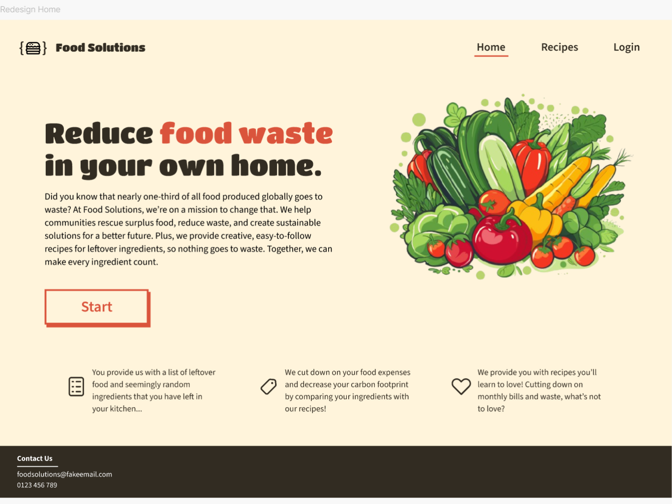
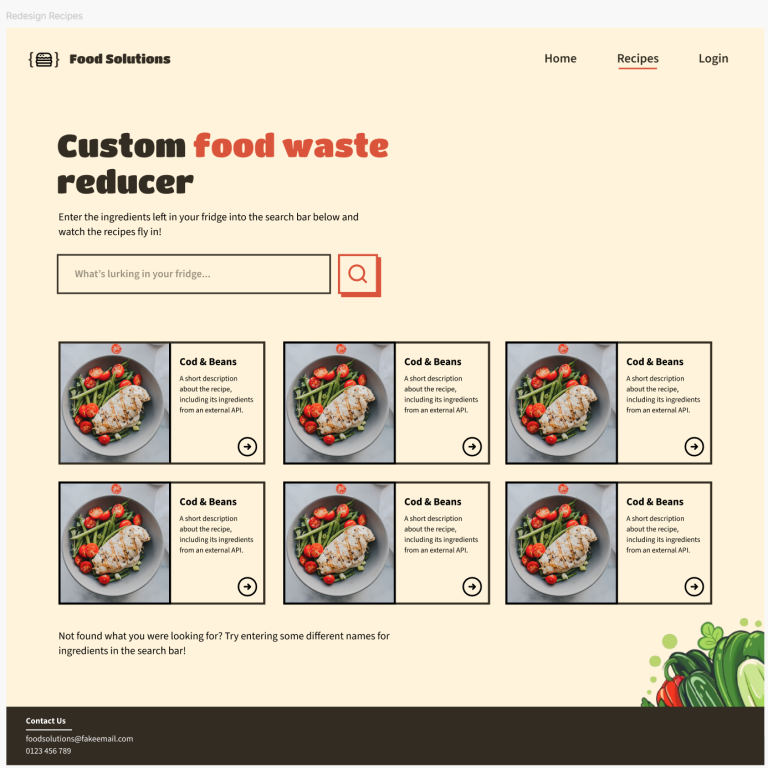
Within the Advanced Web Technologies module, I was tasked with creating a dynamic website with a food theme. For this, I had chosen a recipe maker to reduce food waste and produce gourmet recipes with leftover ingredients. As this project was code and technical-oriented, I didn’t have the opportunity to showcase my design skills as much as I would’ve liked, so, within this portfolio development piece, I have chosen to redesign the aesthetic and visual design of this website to better showcase my abilities and to create a new worthy addition to my professional UX/UI portfolio.
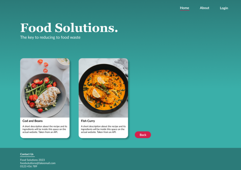
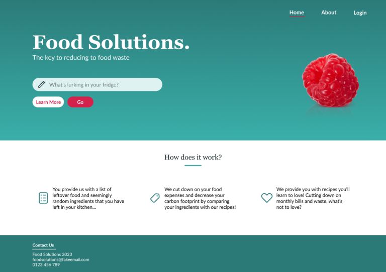
The design of the website is very modern, and colourful. Arguably this is a good design for a website, following a simple colour scheme with contrasting colours, and readable font faces. However, what this design lacks is relevance to the food industry and climate change, key business aims of Food Solutions. The designs are very simplistic, purposefully to account for the fact that they would be developed by myself later. My skills in web development are lower than those of my design skills, hence the scaled-back design. It was discussed within this coursework that within future iterations, a more detailed and interesting visual design would be implemented.
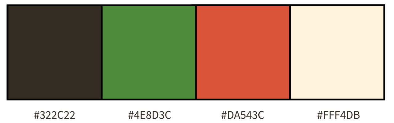
New Colour Palette
To move away from the previous colour palette that didn’t fit the themes of the website, colour schemes that included more natural and earthy tones were explored. The below image shows the final colour scheme that I had settled on, the primary colours being dark brown (#322C22) for the text, footer, and logo, against the cream background (#FFF4DB). The green and red will be used to highlight important areas of text, buttons and other navigation items, but also within page illustrations.
New Typography
Navigation
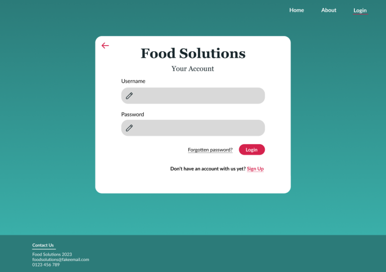
The way the login system worked on the previous pages meant that users would leave the page they are currently on (and their progress) to log in, to then be redirected to their profile page. With the new changes, the login feature is now a pop-up overlay, that can be closed and will automatically pop up when users try to navigate to the profile page without being authenticated.
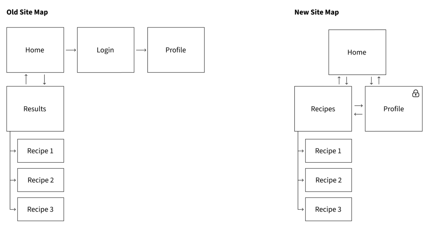
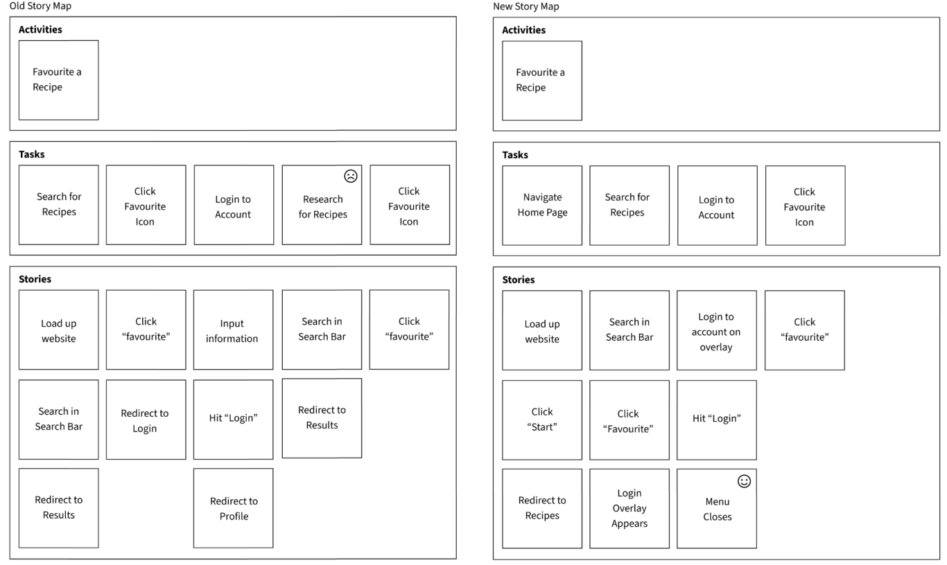
At a glance, the sitemap doesn’t seem to change that much, so to show the changes more clearly, however, in the image below, the difference this change makes to a user story map is detailed. You can see that this new configuration cuts out the annoyance of a mandatory redirect to the profile page after logging in and allows users to stay on the results page while logging in to their account, saving them time.
AFTER
© Copyright. All rights reserved.
We need your consent to load the translations
We use a third-party service to translate the website content that may collect data about your activity. Please review the details in the privacy policy and accept the service to view the translations.